Data Visualization and Digital History
I’m interested in telling stories in multiple ways. At the encouragement of Justin Jocque, the Visualization Librarian at the University of Michigan Library, I learned D3 (for Data-Driven Documents), the Javascript library created by Mike Bostock, formerly of the New York Times.
The projects below are exapmles of recent and old projects that use digital and computational methods to convey the growth of U.S. prison systems since 1970, racial disparities in Florida’s criminal justice system, and the contradictory criminal justice policies that the Florida Legislature has enacted since 1970.
I use ObservableHQ as a place to tinker, and you can see some of my recent tinkerings there.
Chicago Arrests
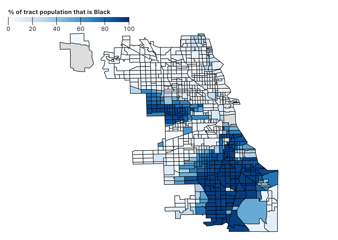
The Chicago Police Department made nearly 640,000 arrests between 2013 to 2018, averaging more than 100,000 arrests a year. Racial disparities in arrests are profound. Police arrested Black men and boys more than 395,000 times between 2013 and 2018. Black men and boys made up more than 60% of all arrests in Chicago in this period, despite making up less than 15% of the population. These maps show where police make arrests alongside Census data showing where Black, Latino, and white people live. Arrests are especially concentrated in Census tracts where Black Americans comprise more than 80% of residents. Read more and see the interactive visualization...
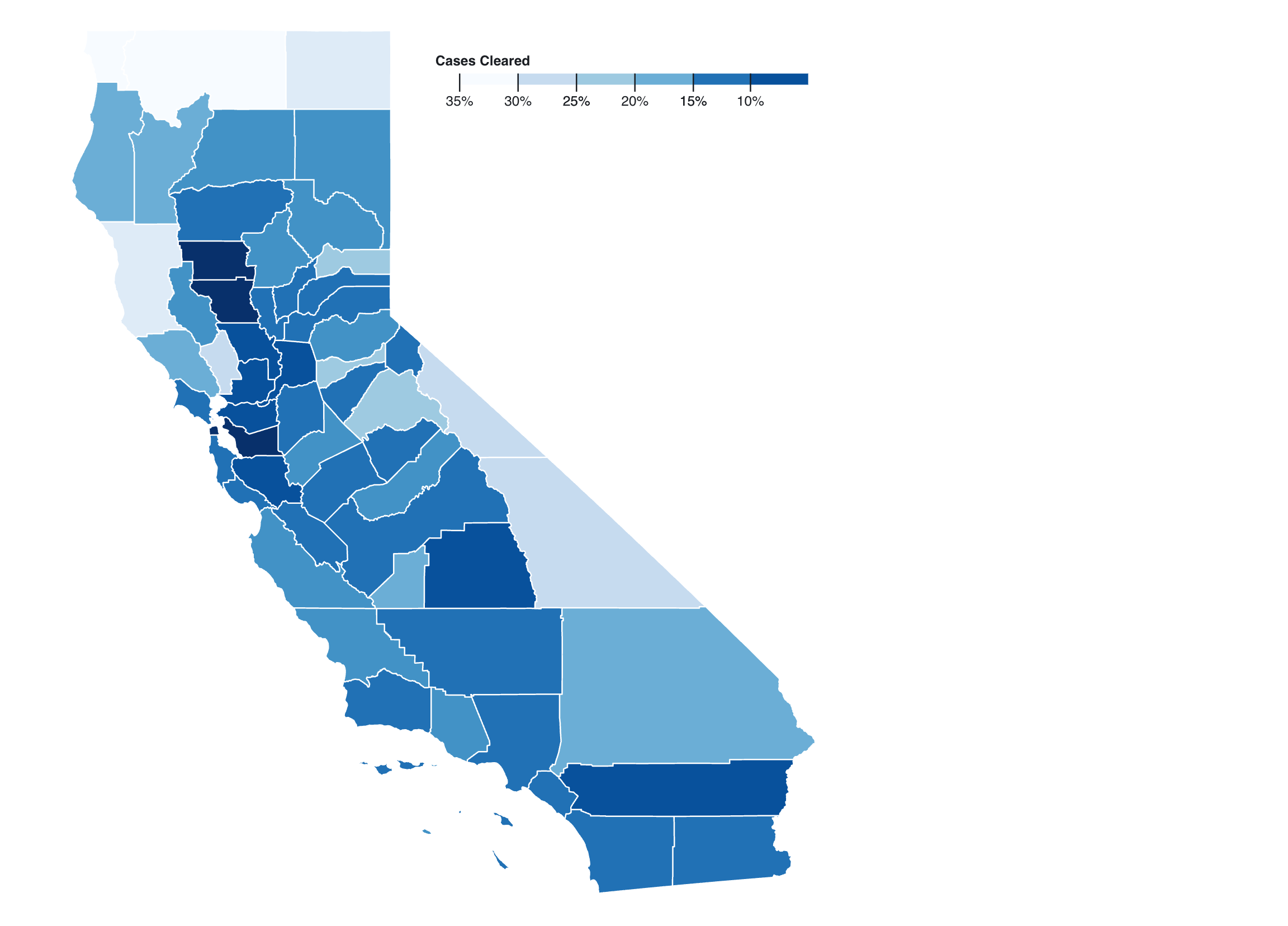
California Criminal Justice Data
I had an opportunity to collaborate with a team from the Center for Juvenile and Criminal Justice on a report about the percentage of reported crimes that are solved by law enforcement. I created these interactive data visualizations so reporters, advocates, and policymakers could easily explore the data in their jurisdictions
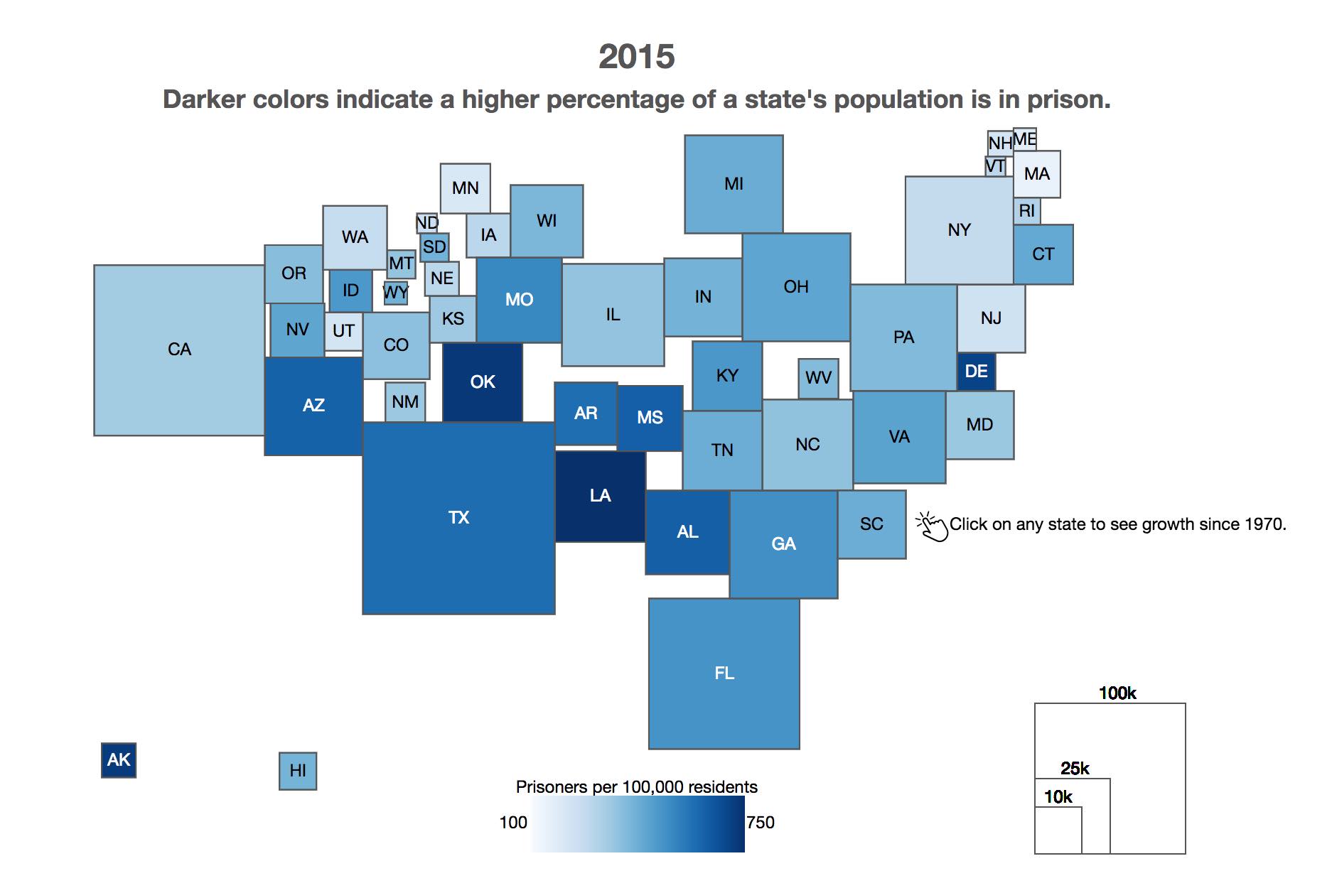
State Imprisonment 1970-2015
Mass incarceration is often depicted graphically with one of the ubiquitous "hockey stick" charts that show the exponential growth of U.S. prisons since the early 1970s. This Demers Cartogram shows the growth of U.S. prison populations while highlighting regional differences. Read more and see the interactive visualization...
Racial and Jurisdictional Disparities
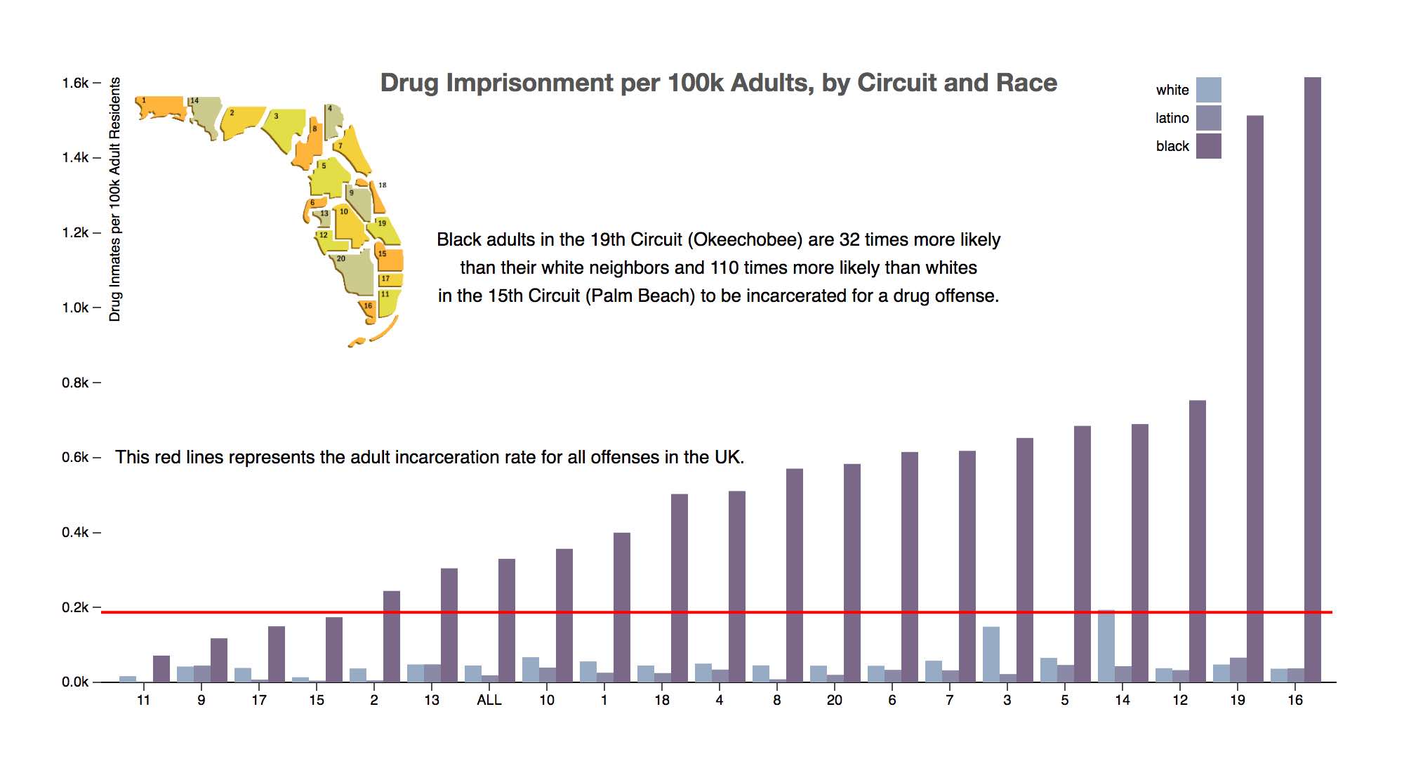
Racial and jurisdictional disparities are defining characteristics of America's criminal justice systems. Where you live and the color of your skin can have a far greater impact on your odds of being incarcerated than what you do.
Disparities are largest at the "lower ends" of the justice system where officials have more discretion. This is especially true regarding imprisonment for drugs. This data visualization shows racial and jurisdictional disparities. Read more and see the interactive visualization...
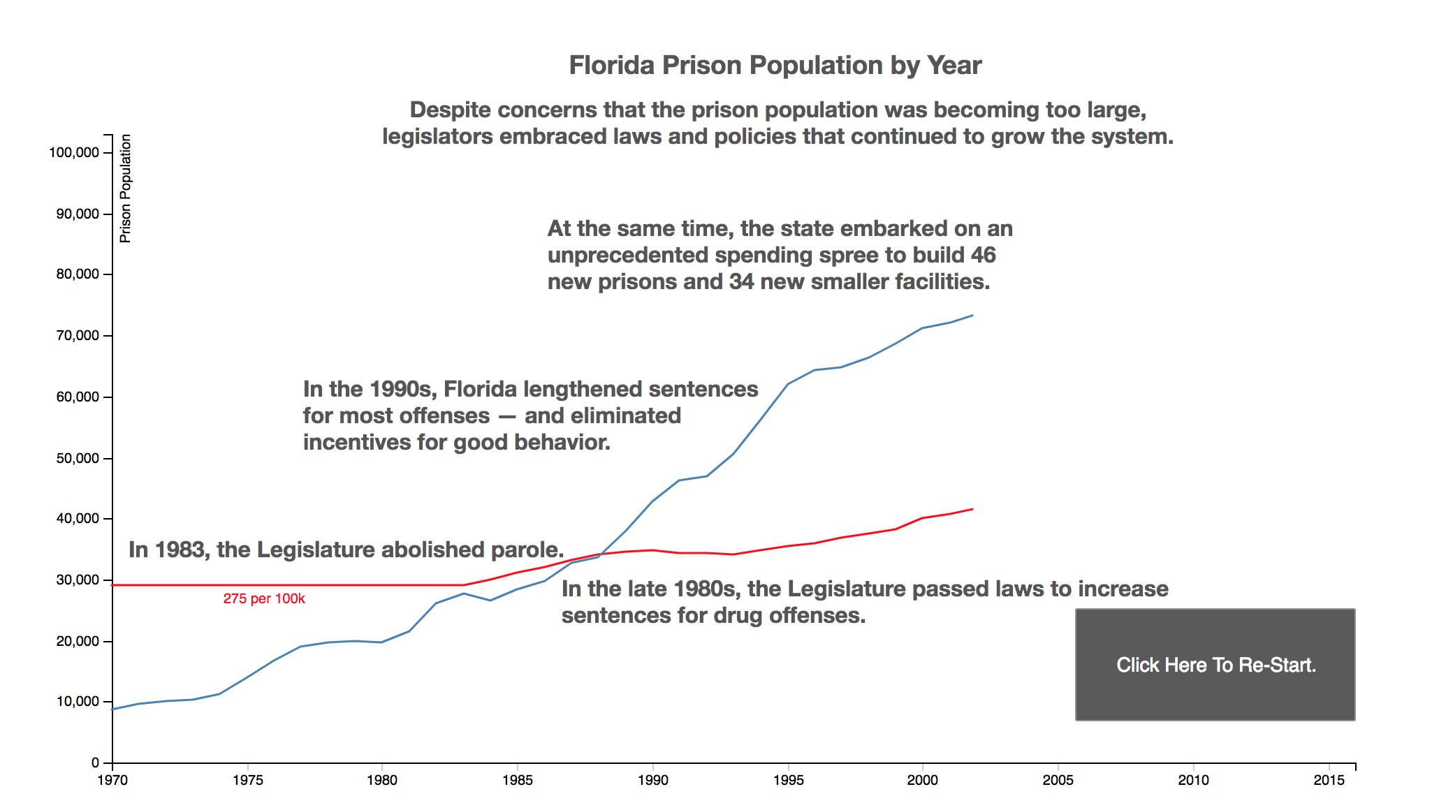
Florida's Prison Growth in Historical Perspective
One of my most puzzling moments in the archives was learning about a 1983 law that placed a ceiling on Florida's prison population of 275 prisoners per 100,000 residents. The very same year that the legislature sought to cap prison growth, it also abolished parole--one of the more consequential setps on the path to mass incarceration. This animated timeline highlights the policies that contributed to mass incarceration, while also pointing out the half-steps that might have prevented it. Read more and see the interactive visualization...